Category: All

  • Services Page for Coaches

    Services Page for Coaches

    Your services page should not make people guess.

    That sounds obvious.

    But many coaching websites still do it.

    The visitor lands on the page.

    They are interested.

    They want to understand what you offer.

    They want to know if your coaching is right for them.

    But the page stays vague.

    It says things like:

    “1:1 coaching available.”

    “Book a call to learn more.”

    “Transform your life and unlock your potential.”

    That may sound positive.

    But it does not answer the buyer’s real questions.

    And when people do not get answers, they hesitate.

    Or they leave.

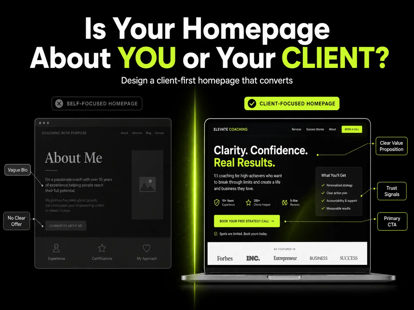
    A clear services page should help the right person feel, “Yes, this is for me.”

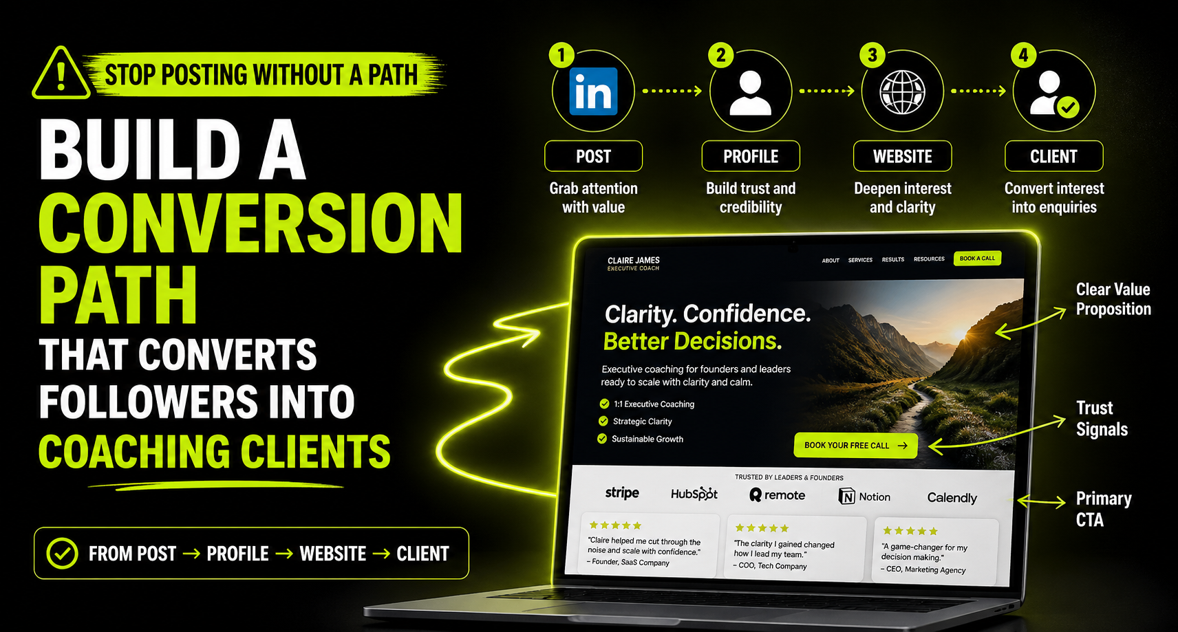
    Why Your Services Page Matters

    Your homepage creates the first layer of clarity.

    Your services page goes deeper.

    This is where a visitor starts asking more serious questions.

    What exactly do you offer?

    Who is it for?

    What kind of problems do you help with?

    How does the process work?

    What happens after I enquire?

    Is this structured?

    Is it flexible?

    Is it worth a conversation?

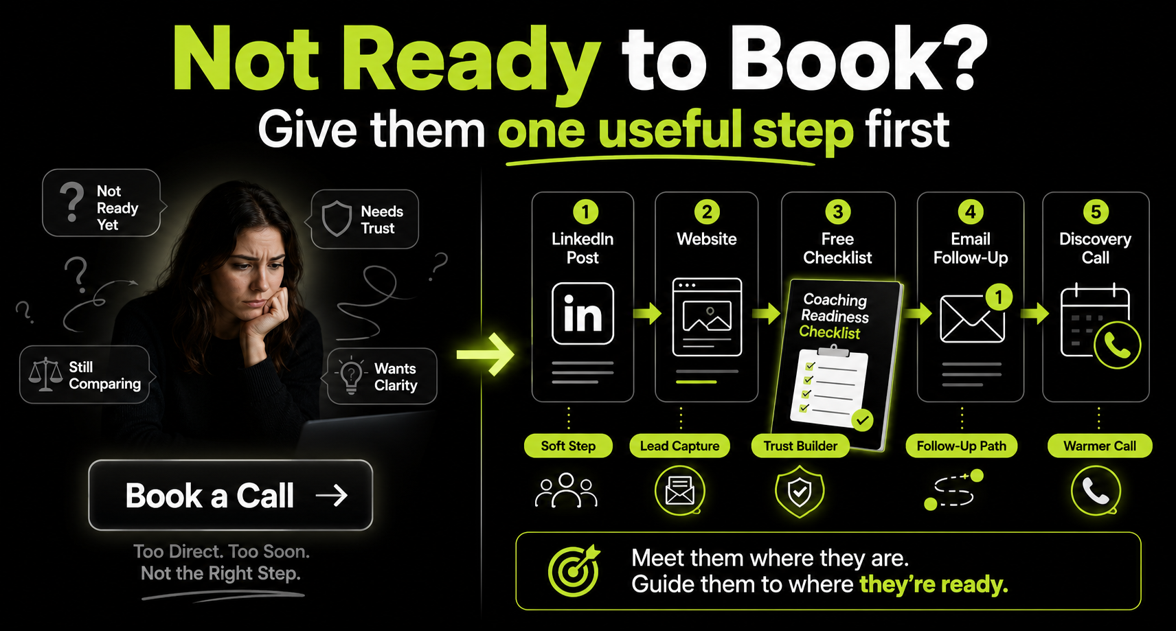
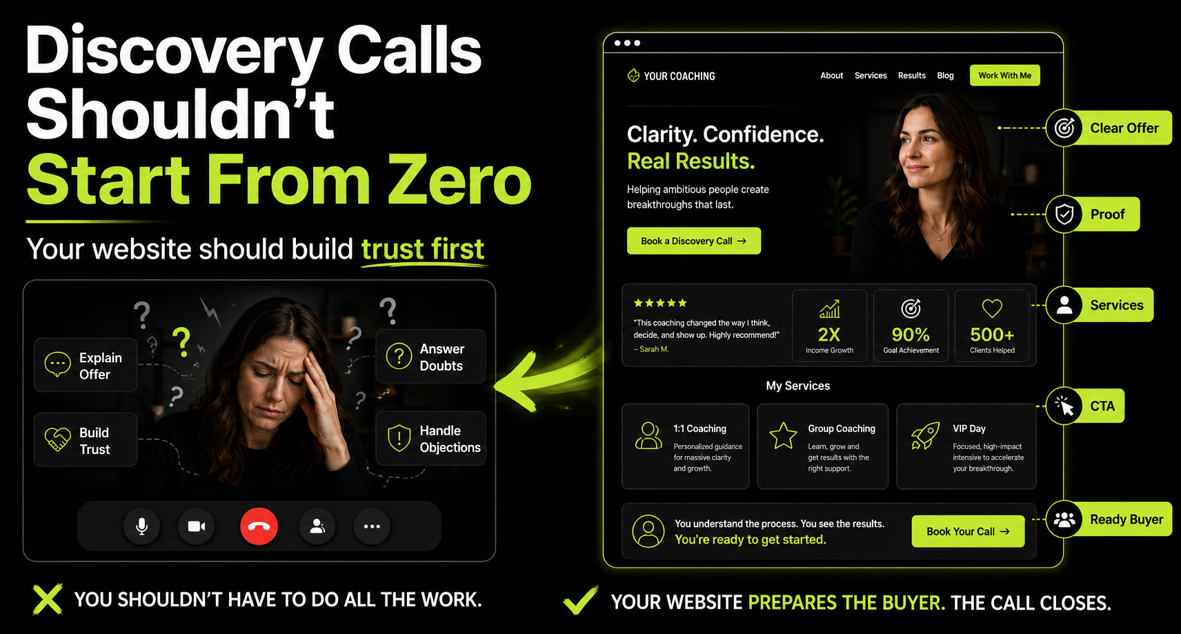
    If your services page does not answer those questions, your discovery call has to do too much work.

    That creates pressure.

    For you.

    And for the buyer.

    A strong services page prepares people before they speak to you.

    It reduces confusion.

    It filters poor-fit leads.

    It makes better-fit people feel safer booking a call.

    If your discovery calls currently feel heavy, this related guide on how coaching discovery calls convert better explains why the pre-call journey matters.

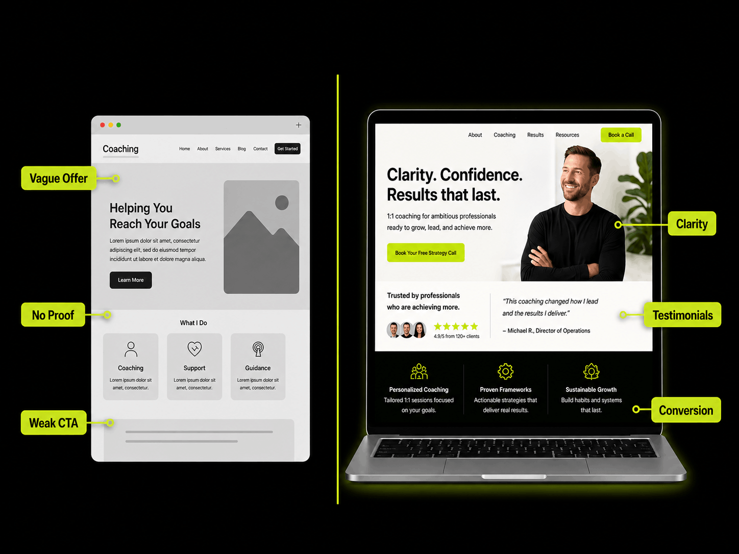
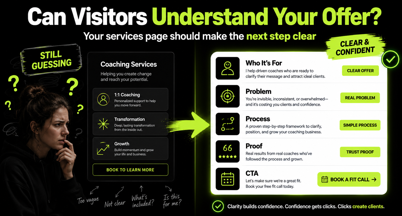
    The Problem With Vague Services Pages

    A vague services page usually sounds warm.

    But it does not say enough.

    It talks about growth.

    Transformation.

    Purpose.

    Empowerment.

    Breakthroughs.

    These words are not bad.

    But if they are not tied to a specific person, problem, or outcome, they become easy to ignore.

    Your visitor is not trying to admire your language.

    They are trying to decide if you can help them.

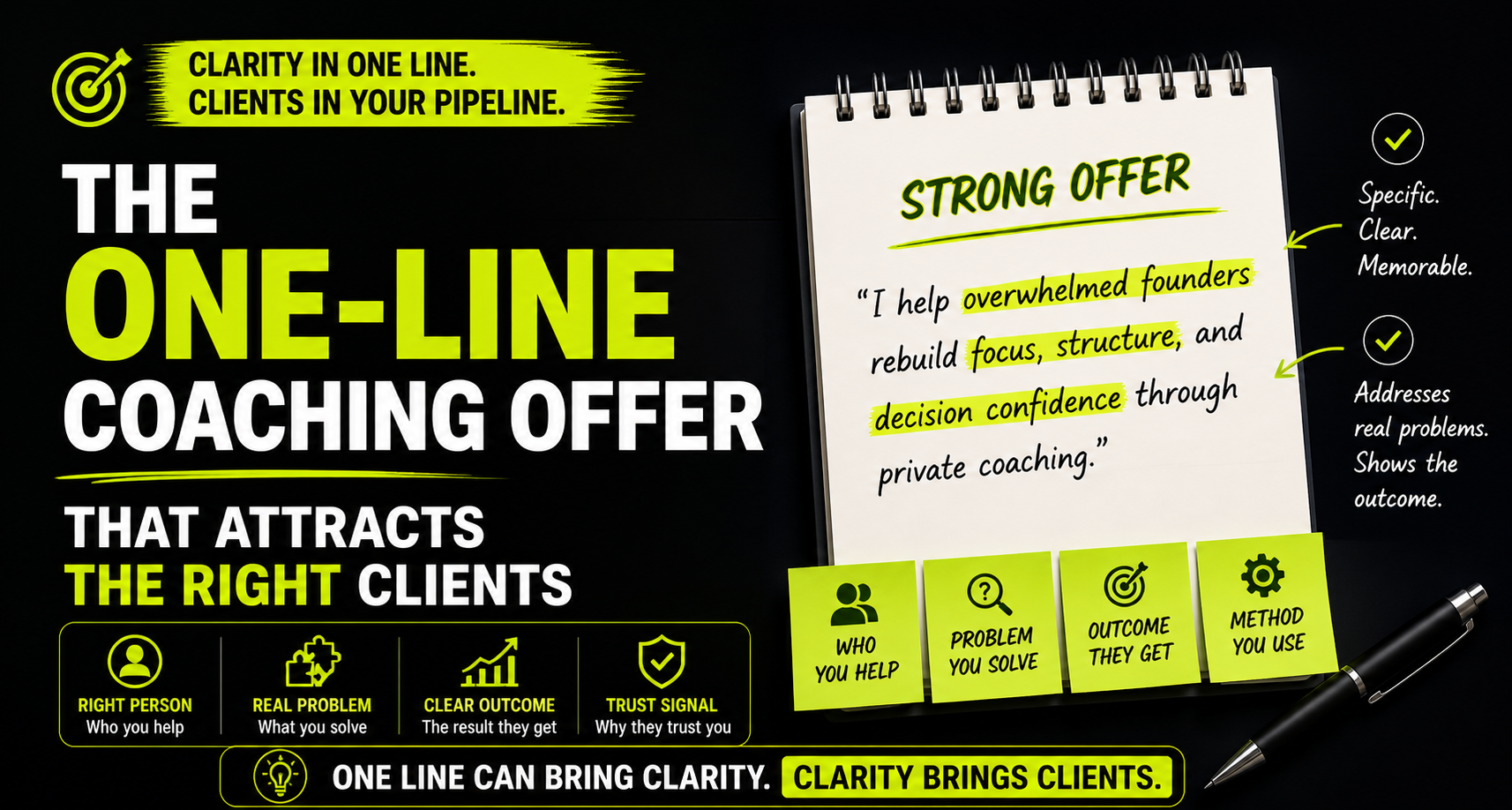
    People do not buy vague transformation. They buy the belief that you understand their specific problem.

    So instead of only saying:

    “I help you become your best self.”

    Say what that actually means.

    For who?

    In what situation?

    With what kind of outcome?

    Through what kind of process?

    That is where clarity starts.

    Start With Who the Service Is For

    Before you explain the coaching, name the person it is built for.

    This helps the visitor place themselves.

    For example:

    • For founders who feel stretched across too many decisions
    • For professionals who want more structure, energy, and personal discipline
    • For leaders who are tired of carrying everything alone
    • For coaches who need a clearer offer and client path
    • For high-achievers who look successful but feel disconnected

    This kind of language does something important.

    It makes the right person pause.

    They see themselves in it.

    They do not have to translate your offer in their head.

    That matters because confused visitors rarely become serious enquiries.

    If you need help clarifying this first sentence, read this article on writing a one-line coaching offer.

    Explain the Problem Clearly

    Your services page should name the problem your coaching helps with.

    Not in a dramatic way.

    In a real way.

    Your ideal client may be thinking:

    “I know I need to change something, but I cannot get traction.”

    “I keep making decisions from stress.”

    “I am doing a lot, but I do not feel in control.”

    “I have outgrown the way I used to operate.”

    Use language close to what they already feel.

    Do not over-polish it.

    Do not hide it behind coaching jargon.

    Say it plainly.

    When the visitor sees their real problem on the page, trust starts earlier.

    The buyer should feel understood before they feel sold to.

    Describe the Outcome

    After naming the problem, show where the coaching is meant to take them.

    Not a fantasy outcome.

    A believable one.

    For example:

    • Clearer weekly structure
    • Better decision confidence
    • Stronger personal boundaries
    • More consistent routines
    • Less reactive leadership
    • A clearer offer and client path
    • More confidence before a major transition

    Outcomes make your offer easier to understand.

    They also help people decide if the coaching is worth exploring.

    If your service page only lists sessions, the visitor has to imagine the value.

    Do not make them do that work.

    Show the result your coaching is designed to support.

    Explain What Happens in the Coaching Process

    This is where many services pages are too thin.

    They say:

    “We will work together through personalised coaching sessions.”

    Fine.

    But what does that mean?

    What happens inside the process?

    Do you start with an audit?

    Do you create a plan?

    Do you use exercises?

    Do you give homework?

    Do you track progress?

    Do clients get support between sessions?

    You do not need to reveal every detail.

    But give enough structure so the visitor feels grounded.

    A simple process section could look like this:

    1. Clarity:
      We identify what is not working and what needs to change.
    2. Structure:
      We build a simple plan around your real life, not an ideal version of it.
    3. Action:
      You apply the work between sessions and bring the real results back.
    4. Adjustment:
      We refine the plan based on what is actually happening.

    This kind of section removes uncertainty.

    It makes the service feel more real.

    People trust what they can understand.

    Make the Format Clear

    Your visitor should know what they are considering.

    Is it private coaching?

    A group programme?

    A workshop?

    A short intensive?

    A monthly retainer?

    A fixed programme?

    Say it clearly.

    For each offer, include simple details like:

    • Format
    • Length
    • Session rhythm
    • Support included
    • Who it is best for
    • What happens after applying or booking

    You do not always need to show pricing.

    But you do need to show the shape of the offer.

    If someone cannot understand the structure, they may not feel ready to enquire.

    Add Proof Near the Offer

    Do not hide proof on a separate testimonials page only.

    Put proof close to the offer.

    When someone is reading your services page, they are already considering whether to trust you.

    That is the right moment to show evidence.

    Use proof like:

    • Specific testimonials
    • Short client stories
    • Before-and-after examples
    • Relevant credentials
    • Client outcomes
    • Podcast or publication features

    But keep it specific.

    A testimonial like this is nice:

    “Working with her was amazing.”

    But this is stronger:

    “Before coaching, I was constantly overthinking decisions. After six weeks, I had a clearer decision process and felt calmer leading my team.”

    That gives the visitor something concrete.

    It shows the change.

    It helps them imagine themselves in the work.

    For a deeper breakdown, read this guide on how a coaching website attracts clients.

    Make the CTA Specific

    Your services page should not end weakly.

    A vague CTA creates hesitation.

    Instead of:

    “Get started.”

    Use something clearer:

    • Book a discovery call
    • Apply for private coaching
    • Schedule a fit call
    • Request a coaching consultation
    • Take the coaching readiness check

    The CTA should match the offer.

    If the service is high-touch, an application might make sense.

    If the service is more accessible, a discovery call may be better.

    If the person is not ready, offer a softer step.

    For example, a checklist, guide, or self-assessment.

    This is where a lead magnet can help.

    If your only CTA is “Book a Call,” read this guide on lead magnets for coaches.

    The CTA should make the next step feel obvious, not risky.

    Do Not Make the Page Too Clever

    Simple beats clever here.

    Your services page is not the place to be mysterious.

    It is not the place to hide the offer behind poetic language.

    It is not the place to make visitors decode your method.

    Clarity wins.

    Use plain headings.

    Use short sections.

    Use examples.

    Use real client language.

    Use proof.

    Use one clear CTA.

    You can still have personality.

    You can still sound premium.

    You can still feel different.

    But do not sacrifice understanding for style.

    If the visitor has to reread your services page to understand the offer, the page is working too hard in the wrong direction.

    A Simple Services Page Structure for Coaches

    Here is a clean structure you can use.

    1. Headline:
      Say who the service is for and what outcome it supports.
    2. Problem section:
      Name the situation your ideal client recognises.
    3. Offer section:
      Explain what the coaching includes.
    4. Process section:
      Show how the work happens.
    5. Proof section:
      Add testimonials, outcomes, or credibility markers.
    6. Fit section:
      Explain who this is best for and who it may not be for.
    7. CTA section:
      Give one clear next step.
    8. FAQ section:
      Answer the doubts people usually have before enquiring.

    This structure is not fancy.

    But it works because it follows how buyers think.

    They do not just want information.

    They want confidence.

    Questions Your Services Page Should Answer

    Before publishing your services page, check if it answers these:

    • Who is this coaching for?
    • What problem does it help with?
    • What outcome can someone reasonably expect?
    • What happens during the coaching?
    • How long does the process take?
    • What kind of support is included?
    • What proof shows this works?
    • Who is not a good fit?
    • What is the next step?
    • What happens after they enquire?

    If those answers are missing, people may still book.

    But they will arrive with more uncertainty.

    That means the discovery call has to do more work.

    And that is exactly what your website should reduce.

    Conclusion

    A clear services page does not need to be complicated.

    It needs to be useful.

    It should help visitors understand what you offer.

    Who it is for.

    What problem it solves.

    What outcome it supports.

    How the process works.

    Why they can trust you.

    And what to do next.

    That is the job.

    Your services page should make the right visitor feel clearer, not more curious.

    Curiosity is good for content.

    Clarity is better for conversion.

    For more coaching website and conversion resources, explore the Coaching Business Growth category or visit the 100XLift blog.

  • Lead Magnet for Coaches

    Lead Magnet for Coaches

    Not every visitor is ready to book a call.

    That does not mean they are a bad lead.

    It usually means they need more time.

    More clarity.

    More trust.

    More proof that your coaching is relevant to their situation.

    This is where many coaches lose people.

    They create content.

    Someone clicks their profile.

    Maybe they visit the website.

    They feel interested.

    But they are not ready to book.

    So they leave.

    No email.

    No follow-up.

    No relationship.

    No next step.

    If your only CTA is “Book a Call,” you are only serving the people who are ready right now.

    A lead magnet gives the not-ready visitor a softer step.

    And for coaches, that matters.

    Why Coaches Need a Lead Magnet

    Coaching is not usually an impulse buy.

    People think about it.

    They compare options.

    They wonder if they really need help.

    They worry about cost.

    They worry about trust.

    They wonder if the coach will understand them.

    That hesitation is normal.

    So your website should not treat every visitor like they are ready to talk today.

    Some are.

    Many are not.

    A lead magnet helps you keep the relationship alive with people who are interested but not ready yet.

    It gives them a simple way to stay close to your thinking.

    It also gives you a way to follow up with value instead of chasing them.

    A good lead magnet does not pressure people. It helps them take one useful step.

    The Problem With Too Many CTAs

    Many coaching websites are not missing CTAs.

    They have too many.

    Book a call.

    Join the newsletter.

    Follow on Instagram.

    Download the guide.

    Watch the video.

    Read the blog.

    Apply now.

    Contact me.

    That may seem helpful.

    But too many options can create confusion.

    The visitor does not know which step matters most.

    So they delay.

    Or they leave.

    A confused visitor rarely becomes a clear lead.

    Your lead magnet should not add more noise.

    It should simplify the path.

    One clear problem.

    One useful resource.

    One next step after that.

    What Makes a Good Lead Magnet for Coaches?

    A good lead magnet is not just a free PDF.

    It should solve a small, specific problem your ideal client already recognises.

    It should feel useful quickly.

    It should connect naturally to your coaching offer.

    And it should help the visitor understand your way of thinking.

    That last part matters.

    Because people are not only downloading information.

    They are quietly asking:

    “Does this coach understand the problem the way I experience it?”

    Your lead magnet should help answer that.

    It should make the reader feel seen.

    Not overwhelmed.

    Not sold to.

    Seen.

    Lead Magnet Ideas for Coaches

    You do not need a complicated funnel to start.

    You need one useful asset.

    Here are some lead magnet ideas that work well for coaches:

    • A self-assessment
    • A coaching readiness checklist
    • A 5-question clarity audit
    • A short decision-making guide
    • A weekly reset template
    • A burnout warning signs checklist
    • A leadership reflection worksheet
    • A “before you book a coach” guide
    • A private email series
    • A short video training

    The best one depends on your audience.

    A leadership coach may use a decision-making audit.

    A health coach may use a routine reset checklist.

    A business coach may use an offer clarity worksheet.

    A life coach may use a values and direction self-assessment.

    The format matters less than the usefulness.

    The best lead magnet is not the biggest one. It is the one your ideal client actually wants to finish.

    Keep the Lead Magnet Small

    This is where many coaches overbuild.

    They try to create a 40-page guide.

    Or a full course.

    Or a huge workbook.

    Or a resource that explains everything they know.

    That is usually too much.

    Your lead magnet should not feel like homework.

    It should feel like relief.

    A short checklist can work better than a long guide.

    A 5-question assessment can work better than a full workbook.

    A one-page audit can work better than a long training.

    Because the goal is not to teach everything.

    The goal is to create movement.

    Small useful steps build more trust than big unfinished downloads.

    Connect the Lead Magnet to Your Main Offer

    Your lead magnet should not be random.

    It should lead naturally toward your coaching offer.

    If you help founders with decision confidence, your lead magnet could be a decision audit.

    If you help professionals rebuild energy, your lead magnet could be a weekly energy reset.

    If you help leaders reduce burnout, your lead magnet could be a burnout pattern checklist.

    If you help coaches clarify their offer, your lead magnet could be a one-line offer worksheet.

    The connection should feel obvious.

    The visitor should think:

    “If this free resource is useful, the coaching may be even more useful.”

    That is the bridge.

    The lead magnet gives them a taste of your thinking.

    Your coaching gives them deeper support, structure, and accountability.

    Put the Lead Magnet in the Right Places

    A lead magnet only works if people can find it.

    Do not hide it in one footer link.

    Place it where visitors are already making decisions.

    Good places include:

    • Your homepage
    • Your blog posts
    • Your services page
    • Your LinkedIn featured section
    • Your LinkedIn About section
    • Your email signature
    • Your booking page

    For example, if someone reads an article about your coaching approach, offer a related checklist at the end.

    If someone visits your services page but is not ready to book, offer a softer step.

    If someone comes from LinkedIn, give them a simple path from content to resource to follow-up.

    This connects directly with your broader content journey.

    If your LinkedIn content is getting attention but not enough enquiries, read this article on posting without a path.

    Build One Clear Follow-Up Path

    The download is not the end.

    It is the beginning of the relationship.

    Once someone downloads your resource, they should not disappear into silence.

    Send a simple follow-up sequence.

    It does not need to be complicated.

    It could look like this:

    1. Email 1:
      Deliver the resource and explain how to use it.
    2. Email 2:
      Share one common mistake related to the topic.
    3. Email 3:
      Tell a short client-style story or example.
    4. Email 4:
      Explain how your coaching helps with the deeper version of the problem.
    5. Email 5:
      Invite them to book a call or take the next step.

    The point is not to spam.

    The point is to stay helpful.

    Trust builds through repeated useful contact.

    If someone gave you their email, do not make the next message feel like a pitch. Make it feel like help.

    Do Not Create Five Lead Magnets at Once

    Many coaches overcomplicate the system.

    They create too many resources.

    One for burnout.

    One for leadership.

    One for confidence.

    One for habits.

    One for goals.

    Then none of them get promoted properly.

    Start with one.

    One problem.

    One audience.

    One resource.

    One follow-up path.

    Once that works, you can expand.

    But do not build complexity before clarity.

    One clear path beats five half-used funnels.

    How This Helps Discovery Calls

    A strong lead magnet also improves your discovery calls.

    People arrive warmer.

    They have already learned something from you.

    They have already seen how you think.

    They have already taken one small step.

    That changes the conversation.

    The call does not have to start from zero.

    The buyer has context.

    You have a clearer reason to follow up.

    And the relationship feels less cold.

    This is why your website should not force every interested visitor directly into a call.

    Some need a bridge first.

    If you want to understand this more deeply, read how coaching discovery calls convert better.

    A Simple Lead Magnet Path for Coaches

    Here is a simple path you can build:

    1. Write one clear content theme.
      Focus on a problem your ideal client already feels.
    2. Create one useful resource.
      Make it small, practical, and directly connected to your offer.
    3. Place it on your website.
      Add it to the homepage, blog posts, and services page where it makes sense.
    4. Promote it on LinkedIn.
      Use posts that naturally lead into the resource.
    5. Follow up with value.
      Send a short email sequence that builds trust and leads toward a call.

    This is not fancy.

    But it works because it respects how people actually decide.

    They do not always jump from attention to purchase.

    Sometimes they need a smaller step first.

    Quick Audit Before You Build One

    Before creating your lead magnet, ask yourself:

    • What problem does my ideal client already know they have?
    • What small win can I help them create quickly?
    • Does this resource connect to my paid coaching offer?
    • Will someone actually finish it?
    • Where will I place it on my website?
    • How will I promote it from LinkedIn?
    • What will I send after they download it?

    If you cannot answer these questions, pause before designing anything.

    The strategy matters more than the PDF.

    A lead magnet is not a file. It is a doorway into a relationship.

    Conclusion

    A lead magnet for coaches does not need to be complicated.

    It does not need to be huge.

    It does not need to look like a full online course.

    It needs to be useful.

    Specific.

    Easy to finish.

    Connected to the problem you solve.

    And placed inside a clear path.

    Because many good clients are not ready the first time they find you.

    That does not mean you should lose them.

    Give them one useful step.

    Follow up with care.

    Let trust build.

    The goal is not to collect emails. The goal is to help the right person move closer to trust.

    For more coaching website and content strategy resources, explore the Coaching Business Growth category or visit the 100XLift blog.

  • Coaching Discovery Calls Convert Better

    Coaching Discovery Calls Convert Better

    How to Make Coaching Discovery Calls Convert Better

    A discovery call should not be the first time a potential client understands what you do.

    That is too much pressure for one call.

    And it is one of the quiet reasons many coaching discovery calls do not convert.

    The person books a call.

    They show up interested.

    But they are still unclear.

    They do not fully understand your offer.

    They are not sure who you work with.

    They have not seen enough proof.

    They still have basic questions your website should have already answered.

    So the discovery call becomes heavy.

    You spend half the conversation explaining.

    The buyer spends half the conversation trying to understand.

    And by the end, both sides feel like there is still too much uncertainty.

    A discovery call converts better when your website has already done some of the trust-building.

    That is the real point.

    Your website should not replace the call.

    It should prepare people for it.

    Why Discovery Calls Feel Harder Than They Should

    Many coaches treat discovery calls as the place where everything happens.

    The offer gets explained there.

    The process gets explained there.

    The proof gets shared there.

    The objections get handled there.

    The buyer finally understands the work there.

    That can work sometimes.

    But it also creates friction.

    Because the buyer arrives without enough context.

    They may be curious, but not confident.

    They may like your content, but not understand your method.

    They may trust your personality, but not yet trust the offer.

    So the call has to do too many jobs.

    If the call has to create clarity, build trust, explain the offer, answer doubts, and close the decision, it is doing too much.

    A better system spreads that work across the buyer journey.

    Your content creates relevance.

    Your profile confirms fit.

    Your website builds trust.

    Your discovery call checks alignment.

    That is a much healthier path.

    If you have not built that path yet, read this related guide on how a coaching website attracts clients.

    Your Website Should Answer Basic Questions Before the Call

    A potential client should not need a call just to understand the basics.

    Before they book, your website should help them answer:

    • Who do you help?
    • What problem do you solve?
    • What outcome can they expect?
    • How does your coaching process work?
    • What makes your approach different?
    • What proof do you have?
    • What happens after they book?

    These are not small questions.

    They are the questions that decide whether someone feels safe enough to move forward.

    When your website ignores them, the call becomes harder.

    When your website answers them clearly, the call becomes easier.

    The person arrives with more confidence.

    They already understand the shape of the work.

    They already know whether the offer sounds relevant.

    They are not starting from zero.

    The best discovery calls do not start with “So, what exactly do you do?”

    They start with a buyer who already understands enough to have a real conversation.

    The Call Should Be About Fit, Not Basic Explanation

    A strong discovery call should help both sides decide if the coaching relationship makes sense.

    It should not feel like a rushed sales presentation.

    It should not feel like a long FAQ session.

    It should not feel like you are trying to prove your value from scratch.

    The call should focus on fit.

    Can you help this person?

    Are they ready for the work?

    Is the problem aligned with your offer?

    Do they trust your process?

    Is the timing right?

    Are expectations realistic?

    These are much better questions than spending the first 20 minutes explaining your services.

    When your website does the early education, the discovery call becomes calmer.

    More focused.

    More honest.

    More useful for both sides.

    Your Homepage Should Prepare the Buyer

    Your homepage is usually the first trust checkpoint.

    If someone comes from LinkedIn, a referral, or a search result, your homepage needs to orient them quickly.

    It should make clear:

    • Who the coaching is for
    • What problem you help with
    • What result the person is moving toward
    • Why your work is credible
    • What step they should take next

    This does not mean your homepage needs to be long or complicated.

    It just needs to be clear.

    The visitor should not have to guess whether they are in the right place.

    If your homepage starts with a long biography, vague promise, or broad motivational language, you may lose people before they ever reach your booking button.

    A client-first homepage can change that.

    For a deeper breakdown, read Client-First Homepage for Coaches.

    Your Services Page Should Reduce Uncertainty

    Your services page should not simply say:

    “Book a call to learn more.”

    That is too thin.

    People usually want more context before they speak to you.

    They want to know what the coaching includes.

    They want to know who it is best for.

    They want to know what kind of problems you usually help with.

    They want to know whether the process is structured or flexible.

    They want to know what happens after they enquire.

    Your services page should answer enough of this to reduce hesitation.

    It does not need to reveal every detail.

    But it should give the visitor enough confidence to book with context.

    Vague services create vague calls. Clear services create better conversations.

    Proof Should Be Visible Before the Call

    Do not save all your proof for the discovery call.

    Put some of it on the website.

    Potential clients want to know that other people have trusted you before.

    They want to know what kind of change your coaching supports.

    They want to know whether your work has helped people in situations like theirs.

    This proof can take different forms:

    • Specific testimonials
    • Short case studies
    • Client outcomes
    • Podcast features
    • Credentials
    • Before-and-after stories
    • Relevant client language

    The key is specificity.

    A vague testimonial like this does not do much:

    “Great coach. Highly recommend.”

    A stronger testimonial gives context:

    “Before coaching, I was constantly overwhelmed and avoiding hard decisions. After a few weeks, I had a clearer weekly structure and more confidence in how I led my team.”

    That kind of proof helps the buyer recognise themselves.

    It builds trust before the call starts.

    Your CTA Should Set Expectations

    A good call-to-action does more than say “Book now.”

    It helps the visitor understand what will happen next.

    Instead of a vague button like:

    “Get Started”

    Use something clearer:

    • Book a discovery call
    • Apply for private coaching
    • Schedule a fit call
    • Request a coaching consultation
    • Take the coaching readiness check

    The wording matters.

    If the call is an application, say that.

    If the call is a consultation, say that.

    If it is a fit call, say that.

    Do not make the visitor guess what they are booking.

    Clear expectations reduce hesitation.

    This is especially important for coaching because the first call can feel personal.

    People want to know whether they are walking into a sales pitch, a genuine conversation, or a structured consultation.

    Make it clear.

    Use a Softer Step for People Who Are Not Ready

    Not everyone who visits your website is ready to book a call.

    That is normal.

    Some people need more time.

    Some are comparing options.

    Some are still trying to understand their problem.

    Some are interested, but not ready to talk.

    If your only option is a discovery call, you may lose them.

    Give them a softer step.

    For example:

    • A checklist
    • A short guide
    • A self-assessment
    • A mini training
    • A private email series
    • A coaching readiness scorecard

    This helps people stay connected until they are ready.

    It also gives you a way to build trust after the first visit.

    This connects closely with your broader content path.

    If you are creating content but not getting enough enquiries, this guide on posting without a path explains why the journey after the post matters.

    What a Better Discovery Call Path Looks Like

    A stronger path might look like this:

    1. LinkedIn post:
      Speaks to a specific pain point your ideal client recognises.
    2. LinkedIn profile:
      Confirms who you help and what outcome you support.
    3. Website homepage:
      Explains your offer, shows proof, and makes the next step clear.
    4. Services page:
      Gives more context about the coaching process and who it is for.
    5. Booking page:
      Sets expectations for the call and removes unnecessary friction.
    6. Discovery call:
      Focuses on fit, readiness, problem depth, and next steps.

    This path is simple.

    But it changes the energy of the call.

    The buyer arrives more informed.

    You spend less time explaining basics.

    The conversation becomes more useful.

    And the decision feels less forced.

    A Quick Audit Before Your Next Discovery Call

    Before you try to fix your call script, audit the journey before the call.

    Ask yourself:

    • Does my homepage clearly say who I help?
    • Does my website explain the problem I solve?
    • Can visitors understand my offer before booking?
    • Is there proof visible before the call?
    • Does my services page explain what happens in the process?
    • Does my CTA tell people what they are booking?
    • Do I have a softer step for people who are not ready yet?
    • Does my LinkedIn content match the website message?

    If several answers are no, the call may not be the real issue.

    The pre-call journey may be weak.

    Before rewriting your discovery call script, fix what the buyer sees before they book.

    Conclusion

    Discovery calls should not do all the work.

    They should not be the first place a potential client understands your offer.

    They should not carry every objection.

    They should not be responsible for building trust from zero.

    Your website should help before the call.

    Your content should help before the call.

    Your proof should help before the call.

    Your CTA should help before the call.

    When that happens, the discovery call becomes easier.

    It becomes more focused.

    It becomes more useful.

    And it becomes more likely to turn into the right kind of client conversation.

    The best discovery calls do not start from zero. They start after trust has already begun.

    For more coaching website and conversion resources, explore the Coaching Business Growth category or visit the 100XLift blog.

  • One Line Coaching Offer That Attracts Clients

    One Line Coaching Offer That Attracts Clients

    Most coaches do not lose clients because they are bad at coaching.

    They lose them because people cannot explain what they actually do.

    A visitor lands on your LinkedIn profile.

    They check your website.

    They read your headline.

    And after a few seconds, they still do not know:

    • Who you help
    • What problem you solve
    • What result you help create
    • Why your work is different
    • Whether they should take the next step

    That is where many coaching businesses quietly lose good prospects.

    Not because the offer is weak.

    Because the offer is unclear.

    Why Your One-Line Offer Matters

    Your one-line offer is the sentence people use to understand you.

    It is not just copywriting.

    It is positioning.

    If someone cannot repeat your offer in simple words, they probably will not remember it.

    And if they cannot remember it, they will not refer it.

    That matters for coaches because most buying decisions are built on trust.

    People are not buying a small product.

    They are considering a relationship.

    They want to know whether you understand their problem before they give you their time, money, and personal story.

    A clear offer gives them that first signal.

    The Problem With Most Coaching Offers

    A lot of coaching offers sound warm but vague.

    You have probably seen lines like:

    • I help people unlock their potential.
    • I help you become your best self.
    • I empower people to create transformation.
    • I guide clients toward growth and fulfilment.

    None of these are wrong.

    But they are too easy to ignore.

    They sound like coaching.

    They do not sound like a specific solution for a specific person.

    That is the issue.

    Your ideal client is not walking around thinking, “I need transformation.”

    They are thinking something much more specific.

    “I cannot stay consistent.”

    “I am exhausted but still underperforming.”

    “I keep avoiding hard decisions.”

    “My business is growing, but I feel like I am falling apart.”

    “I know what to do, but I cannot get myself to do it.”

    Your offer should meet them there.

    A Good Coaching Offer Has Three Parts

    A strong one-line coaching offer usually answers three things.

    1. Who you help
    2. What problem or outcome you focus on
    3. How you help them move forward

    Here is the simple structure:

    I help [specific audience] achieve [specific outcome] through [specific method].

    This is not the only formula.

    But it is a useful starting point.

    It forces clarity.

    It removes vague language.

    It makes the offer easier to understand.

    Weak Offer vs Clear Offer

    Here is the difference.

    Weak: I help people unlock their potential.

    Clearer: I help overwhelmed founders rebuild focus, structure, and decision confidence through private coaching.

    The second version works better because it tells us more.

    We know who it is for.

    We know the problem.

    We know the direction.

    We know the format.

    It does not try to impress everyone.

    It tries to speak to the right person.

    Your Offer Should Not Sound Like Everyone Else

    The fastest way to weaken your coaching website is to sound too broad.

    If your offer could appear on 500 other coaching websites, it is probably not specific enough.

    A vague offer makes the visitor work too hard.

    They have to guess:

    • Is this for me?
    • Is this for my problem?
    • Is this coach experienced with my situation?
    • What would actually happen if I booked a call?

    Most people will not guess for long.

    They will leave.

    That is why your one-line offer should be clear enough that a stranger can understand it in seconds.

    Use Client Language, Not Coaching Language

    This is where many coaches miss it.

    They describe the work from their side.

    The client describes the problem from their side.

    Those are not always the same thing.

    You may say:

    “I help clients reconnect with their authentic self.”

    Your client may say:

    “I feel disconnected from my own life.”

    You may say:

    “I support leadership transformation.”

    Your client may say:

    “I do not know how to lead this team without burning out.”

    Use the language your client already has in their head.

    That is what makes your offer feel real.

    Examples of Stronger One-Line Coaching Offers

    Here are a few examples you can adapt.

    For executive coaches:

    I help senior leaders make clearer decisions, communicate with more confidence, and lead without carrying everything alone.

    For health coaches:

    I help busy professionals rebuild energy, consistency, and healthier routines without extreme diets or unrealistic plans.

    For life coaches:

    I help people who feel stuck rebuild clarity, direction, and daily structure so they can move forward with confidence.

    For business coaches:

    I help service-based founders simplify their offer, improve their sales process, and build a business that is easier to run.

    For mindset coaches:

    I help high-achievers stop overthinking, trust their decisions, and take consistent action without spiralling into self-doubt.

    These are not perfect final offers.

    But they are much easier to understand than “I help people transform.”

    Where to Use Your One-Line Offer

    Your offer should not live in one place only.

    Use it everywhere your prospect may be deciding whether to trust you.

    • Your website hero section
    • Your LinkedIn headline
    • Your LinkedIn About section
    • Your services page
    • Your discovery call page
    • Your email signature
    • Your lead magnet landing page
    • Your short bio

    This creates consistency.

    And consistency builds trust.

    If your LinkedIn says one thing, your website says another, and your services page says something else, the buyer feels the gap.

    They may not explain it clearly.

    But they feel uncertainty.

    Your one-line offer keeps the message tight.

    Your Website Needs This Above the Fold

    The top section of your website should not start with a long story.

    It should quickly answer:

    • Who is this for?
    • What problem is this solving?
    • What result can I expect?
    • What should I do next?

    Your story still matters.

    Your credentials still matter.

    Your philosophy still matters.

    But they work better after the visitor understands why they are in the right place.

    If your homepage starts with you too soon, the visitor may not stay long enough to care.

    That is why your one-line offer should appear early.

    For more context, read this related guide on building a client-first coaching homepage.

    A Simple Test for Your Offer

    Read your current offer out loud.

    Then ask yourself:

    • Can a stranger understand it in five seconds?
    • Does it name a specific audience?
    • Does it point to a real problem or outcome?
    • Does it sound different from generic coaching language?
    • Would a past client recognise themselves in it?
    • Could someone refer you using this sentence?

    If the answer is no, the offer needs tightening.

    Not because your coaching is weak.

    Because the sentence is not doing enough work yet.

    Do Not Make the Offer Too Clever

    Some coaches try to sound unique by making the offer poetic.

    That can backfire.

    Clear beats clever.

    Your offer is not the place to hide the point.

    It is the place to make the point obvious.

    You can bring personality into the rest of the page.

    You can tell stories.

    You can explain your method.

    You can share your values.

    But the first sentence should reduce confusion.

    Connect the Offer to Your Conversion Path

    A strong one-line offer also improves your conversion path.

    It makes your LinkedIn content sharper.

    It makes your profile clearer.

    It makes your homepage easier to understand.

    It makes your services page stronger.

    It makes your discovery calls better because people arrive with more context.

    This matters if you are already posting but not getting enough enquiries.

    Your content may be creating attention.

    But your offer has to help turn that attention into action.

    If you have not built that path yet, read this article on why posting without a path does not convert.

    Final Thoughts

    A one-line coaching offer will not fix everything.

    But it will expose a lot.

    If you cannot say what you do clearly, your website will struggle.

    Your LinkedIn profile will feel vague.

    Your services page will sound soft.

    Your discovery calls will do too much explaining.

    And your potential clients will keep guessing.

    A clear offer does not make your coaching smaller.

    It makes it easier to trust.

    And in coaching, trust starts before the first call.

    FAQ

    What is a one-line coaching offer?

    A one-line coaching offer is a clear sentence that explains who you help, what problem you solve, and what outcome your coaching supports.

    Why do coaches need a clear offer?

    Coaches need a clear offer because potential clients must quickly understand whether the coaching is relevant to their situation. If the offer is vague, people hesitate or leave.

    Where should I use my coaching offer?

    Use it on your homepage, LinkedIn profile, services page, discovery call page, email signature, and lead magnet landing pages.

    What makes a coaching offer weak?

    A coaching offer becomes weak when it uses broad language, does not name a specific audience, and does not explain a clear problem or result.

    Should my coaching offer be short or detailed?

    Your main offer should be short enough to understand quickly. You can explain the details later on your services page or discovery call page.

  • Client First Homepage for Coaches

    Client First Homepage for Coaches

    Your website is not just a digital business card.

    For many coaches, it is the first place a potential client goes after seeing a post, hearing your name, or getting a referral.

    That moment matters.

    If your homepage mostly talks about you, your story, your certifications, and your passion, the visitor may still leave with one unanswered question:

    “Is this coach actually right for me?”

    A client-first homepage answers that question quickly.

    It does not ignore your story.

    It simply starts with the visitor’s problem first.

    It shows who you help, what outcome you support, and why someone should trust you enough to take the next step.

    If you want the bigger picture first, you can also read this guide on how to build a coaching website that attracts clients.

    Why a Client-First Homepage Matters

    Your homepage is often where people orient themselves.

    Even if someone lands on a blog post, social link, or services page first, they may still click back to the homepage to understand the bigger picture.

    They want to know what you do.

    They want to know who you help.

    They want to know whether your work feels relevant to their situation.

    And they usually decide very quickly.

    If your homepage does not make that clear, most visitors will not take the time to figure it out.

    They will leave.

    Not because they disliked you.

    Not because your coaching is weak.

    Because the page did not give them enough confidence to stay.

    People do not book coaching because a website looks nice. They book when they feel understood, safe, and clear about the next step.

    Coaching is a personal decision.

    A visitor may be dealing with stress, confusion, burnout, lack of direction, leadership pressure, health struggles, or a major life transition.

    They are not casually shopping.

    They are asking quiet questions in their mind:

    • Will this person understand me?
    • Can I trust them?
    • Have they helped people like me?
    • What kind of result can I expect?
    • What happens if I book a call?

    A strong homepage helps answer those questions before the visitor has to ask.

    Craft a Clear, Outcome-Focused Value Proposition

    The first section of your homepage should not make people work hard.

    It should tell them, in simple language, what you do and why it matters.

    This is where your value proposition comes in.

    It should usually answer three things:

    • Who you help
    • What problem or outcome you focus on
    • How you help them move forward

    For example, this is too broad:

    “I help people unlock their potential.”

    It sounds positive.

    But it could mean almost anything.

    A clearer version would be:

    “I help overwhelmed founders rebuild focus and decision confidence without adding more pressure to their week.”

    That sentence does more work.

    It names the audience.

    It names the problem.

    It gives the visitor a direction.

    The goal is not to sound clever.

    The goal is to make the right person think:

    “This sounds like me.”

    This is also why your website and LinkedIn content need to connect. If you are posting regularly but not getting enough enquiries, this article on posting without a path explains where that gap usually happens.

    Show Your Personal Brand and Story

    Your story still matters.

    In coaching, people are not just buying sessions.

    They are buying into your thinking, your energy, your lived experience, and your ability to guide them.

    So yes, your background matters.

    Your values matter.

    Your reason for doing this work matters.

    But timing matters too.

    If your homepage starts with a long biography before the visitor understands whether you can help them, your story may not land.

    Start with the client’s situation first.

    Then bring in your story as proof of why you are the right guide.

    Your About section should not read like a résumé.

    It should help the visitor understand:

    • Why you do this work
    • What shaped your approach
    • Who you are best suited to help
    • Why your perspective is trustworthy

    Use photos that match the type of coaching you offer.

    If you are a high-performance coach, your visuals should feel sharp and confident.

    If you are a wellness or mindfulness coach, your visuals may need to feel calmer and more grounded.

    The point is not to look perfect.

    The point is to feel real and aligned.

    Design Services Pages Around Outcomes

    Your services page is where interest starts turning into decision-making.

    This is where many coaching websites become too thin.

    They say something like:

    “1:1 coaching available. Book a call to learn more.”

    That is not enough.

    Before someone books, they usually want to understand what they are stepping into.

    They want to know who the offer is for.

    They want to know what kind of problem it solves.

    They want to know what happens during the process.

    They want to know what result they can reasonably expect.

    So instead of only listing sessions, describe the transformation.

    For example, instead of saying:

    “6 coaching sessions over 3 months.”

    You could say:

    “A 3-month coaching process to help you simplify your priorities, rebuild decision confidence, and create a weekly structure you can actually follow.”

    That feels clearer.

    It gives the visitor something to imagine.

    It also makes the discovery call easier because the person arrives with context.

    For more articles around coaching growth, website clarity, and conversion, you can explore the Coaching Business Growth category.

    Offer Lead Magnets for Visitors Who Are Not Ready Yet

    Not every visitor is ready to book a call today.

    That does not mean they are a bad lead.

    Some people need more time.

    Some are still comparing options.

    Some are interested but not ready to talk.

    Some want to understand your approach before they share their situation.

    If your only option is “Book a Call,” you may lose people who could become clients later.

    This is where a lead magnet helps.

    A lead magnet is simply a useful free resource that gives visitors a smaller first step.

    For coaches, this could be:

    • A short checklist
    • A self-assessment
    • A short guide
    • A mini training
    • A quiz
    • An email series

    The goal is not to give away everything.

    The goal is to build trust.

    A good free resource does not weaken your coaching offer. It helps the right person feel safer taking the next step.

    Use Social Proof That Actually Builds Trust

    Trust is everything in coaching.

    People want to know that others have worked with you and experienced real change.

    But not all proof is equal.

    A vague testimonial like this is nice, but weak:

    “She was amazing. I highly recommend her.”

    It sounds positive.

    But it does not explain what changed.

    A stronger testimonial gives context:

    “Before coaching, I was constantly reacting to everyone else’s priorities. After a few weeks, I had a clearer weekly structure, stronger boundaries, and more confidence in difficult conversations.”

    That kind of proof is more useful.

    It shows the before.

    It shows the after.

    It helps the visitor recognise their own situation.

    Your homepage and services page should include proof near the points where people are deciding whether to act.

    Use testimonials, short case studies, client outcomes, podcast features, publication logos, or any relevant credibility signals.

    Just make sure they are specific.

    Generic proof feels decorative.

    Specific proof builds confidence.

    If you want to go deeper into how a coaching website can turn trust into enquiries, read Coaching Website That Attracts Clients.

    Prioritise Simple Navigation and User Experience

    Your website should not feel like a maze.

    A visitor should be able to quickly find:

    • What you do
    • Who you help
    • How your coaching works
    • Proof that you can help
    • How to take the next step

    Use simple navigation labels.

    Home.

    About.

    Services.

    Blog.

    Contact.

    You do not need clever names for basic pages.

    Clever navigation often creates unnecessary friction.

    And friction makes people leave.

    The same applies to images.

    Avoid generic stock photos that could belong to any coach, consultant, or wellness brand.

    Use visuals that support your message.

    Real photos, behind-the-scenes images, client-relevant situations, or simple visuals that explain your process usually work better.

    Good design does not make people guess. It quietly guides them.

    Create Clear Calls to Action and a Seamless Booking Experience

    Every important page should have a clear job.

    Your homepage should guide visitors somewhere.

    Your services page should guide visitors somewhere.

    Your blog posts should guide visitors somewhere.

    That “somewhere” should not be vague.

    Instead of using only soft CTAs like:

    “Learn more.”

    Use something more specific:

    • Book a discovery call
    • Apply for coaching
    • Download the coaching checklist
    • Take the self-assessment
    • Get the free guide

    Your primary CTA should be for people who are ready to talk.

    Your secondary CTA should be for people who need more time.

    Also, make the booking process simple.

    If someone has to message you back and forth just to find a time, you are adding friction at the worst possible moment.

    Use a clear booking page, calendar tool, or contact form that makes the next step easy.

    Design for Mobile and Speed

    Many visitors will check your website from their phone.

    They may be coming from LinkedIn.

    Or Instagram.

    Or a referral message.

    Or a quick Google search.

    That means your homepage needs to work well on a small screen.

    Your headline should be readable.

    Your CTA should be easy to tap.

    Your proof should not be buried too far down.

    Your page should load quickly.

    A slow or cluttered mobile experience makes your coaching feel harder to trust, even if your offer is strong.

    Use compressed images.

    Keep the layout simple.

    Avoid unnecessary effects that slow the page down.

    The goal is not to impress people with complexity.

    The goal is to help them move.

    Answer Real Questions and Provide Useful Content

    A good coaching website should answer the questions people already have.

    Not just the questions you wish they had.

    Visitors may want to know:

    • How does coaching work?
    • Who is this best for?
    • What kind of results are realistic?
    • How long does the process take?
    • What happens on the first call?
    • What if I am not ready yet?
    • How is this different from therapy, consulting, or mentoring?

    Your homepage does not need to answer everything.

    But your website should give people a way to explore.

    This is where blogs, FAQs, guides, podcasts, and resource pages help.

    Useful content builds trust before the call.

    It also helps people understand your thinking.

    That matters because coaching is not just about what you offer.

    It is also about how you see the problem.

    You can keep building this trust through educational content on your 100XLift blog.

    Make Contact Easy

    When someone is ready to reach out, do not make them hunt.

    Your contact path should be obvious.

    Put your booking link or contact button in visible places.

    Add your email where appropriate.

    Keep your contact form simple.

    Link to your social profiles if you want people to stay connected.

    If you run events, group programmes, or workshops, make those easy to find too.

    The easier the next step feels, the more likely someone is to take it.

    Small friction can kill real interest.

    Conclusion

    A client-first homepage is not about adding more sections.

    It is not about flashy graphics.

    It is not about making the site look expensive for the sake of it.

    It is about making the visitor feel clear.

    Clear about who you help.

    Clear about the problem you solve.

    Clear about why they should trust you.

    Clear about what they should do next.

    That is what separates a passive coaching website from one that actually supports client growth.

    Lead with the client’s problem.

    Show your story as proof.

    Describe your services through outcomes.

    Give not-ready visitors a softer step.

    Use proof that feels specific.

    Make the path easy.

    The best coaching websites do not try to impress everyone. They help the right person feel confident enough to move forward.

    For more coaching business growth resources, visit the 100XLift homepage or browse the Coaching Business Growth category.


    Sources

    1. Nielsen Norman Group – Homepage Usability Guidelines: Research emphasising clear taglines, simple navigation, and useful homepage content.
    2. International Coaching Federation – Building a Coaching Website: Guidance on clarity, authentic connection, testimonials, and contact information.
    3. IGV – How to Structure a Homepage That Converts in 2026: Advice on value propositions, hierarchy, trust signals, and calls to action.
    4. Elementor – Inspiring Coaching Websites to Model in 2026: Insights on value propositions, personal branding, services pages, lead magnets, and social proof.
    5. ImpactPlus – Website Strategy in 2026: Discussion of buyer-focused websites, answering real questions, and providing proof.
    6. Call to Action (Marketing): Definition and role of clear action language in marketing.
    7. Testimonial (Marketing): Background on testimonials and their use as trust-building content.
  • How to Build a Coaching Website That Attracts Clients

    How to Build a Coaching Website That Attracts Clients

    A lot of coaching websites look fine at first glance.

    Nice photo.
    Clean colours.
    A short bio.
    A few testimonials.
    A button that says “Book a Call.”

    Nothing looks broken.

    But the problem is not always how the website looks. The problem is what happens in the visitor’s mind after they land there.

    They read the homepage and still do not feel sure.

    • They do not know if the coach works with people like them.
    • They do not understand what kind of result the coaching is built around.
    • They cannot see enough proof.
    • They are not sure what makes this coach different from the next one.

    So they leave.

    Not because they hated the website.

    Because it did not give them enough confidence to take the next step.

    That is the real job of a coaching website. It is not just there to introduce you. It is there to help the right person feel, “This actually speaks to my situation.”

    And that is where most coaching websites fall short.

    A coaching website should not feel like an online brochure

    Many coaches still treat their website like a digital business card.

    They add the basic pages:

    1. Home.
    2. About.
    3. Services.
    4. Testimonials.
    5. Contact.

    That structure is not wrong, but it is not enough on its own.

    A person thinking about coaching is usually not making a casual decision. They may be dealing with stress, confusion, leadership pressure, low confidence, burnout, business problems, health issues, relationship tension, or a big life transition.

    They are not just asking, “Does this coach have a website?”

    They are asking quieter questions:

    • Will this person understand me?
    • Can I trust them?
    • Have they helped someone in my position?
    • Is this going to be worth my time?
    • What happens if I book a call?

    If your website does not answer these questions clearly, the visitor has to fill in the blanks.

    Most people will not do that work.

    They will move on.

    The first section needs to be much clearer than most coaches think

    The top of the homepage is where many websites lose people.

    A visitor should not need to scroll, think hard, or read five paragraphs to understand what you do.

    They should quickly understand three things:

    1. Who do you help?
    2. What problem do you help them with?
    3. What kind of outcome are they moving toward?

    A weak headline usually sounds like this:

    “I help you unlock your full potential.”

    That sounds nice, but it is too broad. Almost any coach could say it.


    A stronger version would be:

    “I help overwhelmed founders rebuild focus, structure, and decision confidence without adding more pressure to their week.”

    That is better because it gives the visitor something real to hold onto.

    It tells them who the work is for.
    It names the pain.
    It gives a direction.

    This does not mean every sentence has to be clever. In fact, the best coaching websites usually sound simple. The visitor should not be impressed by the wording. They should feel understood by it.

    Your story matters, but it should not do all the heavy lifting

    A lot of coaches lead with their personal story.

    That is understandable.

    Your story explains why you care. It shows your values. It gives people a reason to connect with you.

    But the visitor usually arrives with their own problem at the front of their mind.

    If the homepage starts too much with your journey, your philosophy, your mission, and your background, the visitor may not see themselves quickly enough.

    A better approach is to start with the client’s current reality.

    • Talk about what they are struggling with.
    • Talk about the patterns they recognise.
    • Talk about the gap between where they are and where they want to be.

    Then bring in your story later, once they already feel that you understand the problem.

    Your about page can still be personal. It should be. But even there, the story should connect back to the client.

    The reader should not just think, “This person has had an interesting journey.”

    They should think, “This person understands the kind of change I am trying to make.”

    The offer needs to be easy to repeat

    Here is a simple test.

    Could someone read your website and explain your offer to a friend in one sentence?

    If not, the offer is probably too vague.

    Many coaching websites use words like:

    1. Transformation.
    2. Growth.
    3. Purpose.
    4. Potential.
    5. Alignment.
    6. Empowerment.
    7. Breakthrough.

    These words are not bad, but they become weak when they are not connected to a specific problem or audience.

    A clearer offer sounds more like this:

    “I help senior professionals rebuild energy, structure, and personal discipline through private coaching.”

    Or:

    “I help business owners who feel stuck simplify their priorities and make better decisions with more confidence.”

    Or:

    “I help high-performing men get their health, habits, and personal standards back under control.”

    None of these are perfect for every coach, but they are easier to understand.

    That is the point.

    People do not buy what they cannot explain to themselves.

    Proof should be specific, not decorative

    Most coaching websites include testimonials, but many of them are too soft to be useful.

    Something like this does not say enough:

    “Working with Sarah was amazing. I highly recommend her.”

    It is kind, but it does not help the next person understand what changed.

    A more useful testimonial would sound like this:

    “Before coaching, I was constantly reacting to everyone else’s priorities. After a few weeks, I had a clearer weekly structure, stronger boundaries, and more confidence in how I handled difficult conversations at work.”

    That kind of testimonial is stronger because it shows a before and after.

    It gives context.

    It tells the reader what problem the client had and what improved.

    For coaching, this matters because the work can feel intangible from the outside. You are not selling a simple product with obvious features. You are selling support, thinking, accountability, structure, and change.

    So the proof needs to make the invisible parts more visible.

    Use testimonials that mention:

    • The problem before coaching.
    • The reason they reached out.
    • What the coaching helped them change.
    • What felt different after the work.

    You do not always need numbers. You need believable detail.

    Case studies can make the website feel much more real

    A short case study can often do more than a long list of testimonials.

    It does not need to be dramatic. It just needs to be clear.

    For example:

    A founder came to coaching because everything in the business depended on them. They were working late, making rushed decisions, and constantly switching between urgent problems. The work started by simplifying their weekly priorities and creating a better decision rhythm. Over time, they became less reactive, delegated more clearly, and felt more in control of their role.

    That short story helps a visitor imagine the work.

    • They can see the starting point.
    • They can see the process.
    • They can see the outcome.

    That is what generic copy cannot do.

    If privacy is a concern, you can anonymise the client. You can remove names, industries, or sensitive details. But keep the situation real enough that the reader can understand the transformation.

    Your services page should not just list packages

    A services page should help people decide whether they are in the right place.

    Too many coaching websites say something like:

    “1:1 coaching available. Book a call to learn more.”

    That is not enough.

    Before booking, people usually want to know:

    1. What kind of person is this for?
    2. What problems do you usually work on?
    3. How long does the process last?
    4. What happens during the coaching?
    5. Is this structured or flexible?
    6. What should someone expect before they book?
    7. Who is not a good fit?

    You do not need to explain every tiny detail. But you do need to remove enough uncertainty.

    The goal of the services page is not only to sell the offer.

    It should also filter the wrong people out.

    When your services page is clear, the people who book calls arrive with a better context. The conversation becomes easier because they already understand the shape of the work.

    That saves time for both sides.

    The call to action should match the visitor’s readiness

    Not everyone who visits your website is ready to book a call.

    Some people are just discovering you.

    Some are comparing options.

    Some like your content but are not ready to speak yet.

    Some need to understand your method before they share their situation with you.

    If the only option is “Book a Call,” you may lose people who could become good leads later.

    A better website gives two paths.

    One for people who are ready now.

    One for people who need more trust first.

    The ready-now path can be:

    Book a discovery call.
    Apply for coaching.
    Schedule a consultation.

    The softer path can be:

    Download a checklist.
    Take a short assessment.
    Read a guide.
    Join the email list.
    Watch a short training.

    This matters because coaching decisions often take time.

    Someone may not book today. But if your website gives them a useful next step, they stay connected to your world.

    That is better than losing them completely.

    LinkedIn should not send people to a weaker version of your message

    Many coaches are putting real effort into LinkedIn.

    They are posting better content, sharing ideas, telling stories, and building authority.

    But then someone clicks through to their website and the message becomes generic.

    That is a problem.

    Your LinkedIn content may talk about real issues like burnout, leadership pressure, confidence, discipline, decision-making, identity, health, or personal standards.

    Then your website says:

    “Helping you become your best self.”

    The energy drops.

    The specificity disappears.

    The visitor feels the gap.

    Your website should feel like a continuation of the same conversation.

    If your LinkedIn posts are sharp and specific, your website should be sharp and specific too.

    If your content speaks to executives, founders, parents, athletes, or high-performing professionals, your website should make that clear.

    Attention from content is useful. But attention without a clear path usually disappears.

    A simple website check for coaches

    Before you redesign anything, go through your website and ask these questions.

    1. Can a new visitor tell who you help within the first few seconds?
    2. Can they understand the main problem you solve?
    3. Is your offer specific enough to repeat in one sentence?
    4. Does your homepage talk about the client before it talks too much about you?
    5. Do your testimonials show real change, or do they only say nice things?
    6. Can someone understand your coaching process before booking a call?
    7. Does your services page help people decide if they are a fit?
    8. Do you have a softer next step for people who are not ready to book?
    9. Is your contact or booking path easy to find?
    10. Does your website match the topics you talk about on LinkedIn?

    If the answer is no to several of these, your website may not need a complete redesign.

    It may need a clearer message and a better path.

    Final thoughts

    A coaching website does not need to be complicated.

    It does not need fancy animations.
    It does not need ten pages.
    It does not need to sound like every other coach online.

    It needs to make the right person feel understood.

    It needs to explain the offer clearly.

    It needs to show enough proof.

    It needs to make the next step feel simple.

    That is what turns a coaching website from a static online profile into something useful for client growth.

    The best coaching websites do not try to impress everyone.

    They help the right person feel confident enough to move forward.

    And that is the real work.

    If your coaching website gets visitors but does not bring enough serious enquiries, 100XLift can help you review the weak points.

    We look at your homepage, offer, proof, services page, and call-to-action path so you can see where potential clients may be dropping off before they ever book a call.

    FAQ

    What should a coaching website include?

    A coaching website should include a clear homepage, a specific offer, an about page, a services page, testimonials, case studies, a clear coaching process, FAQs, and an easy way to book a call or take a smaller next step.

    Why is my coaching website not getting clients?

    Your website may not be getting clients because the message is too broad, the offer is unclear, the proof is weak, or the visitor does not know what to do next. In many cases, the issue is not traffic. It is unclear positioning.

    How can coaches make their website more trustworthy?

    Coaches can build trust by using specific testimonials, short case studies, clear process explanations, credentials, helpful FAQs, and honest copy that speaks directly to the client’s real situation.

    Should a coach have a blog?

    Yes, a blog can help if it answers the questions your ideal clients already have. A coaching blog should not be random content. It should support your positioning, explain your approach, and help visitors trust your thinking.

    What is the best call to action for a coaching website?

    The main call to action is usually a discovery call or consultation. But it also helps to offer a smaller step, such as a checklist, guide, quiz, or email resource for visitors who are interested but not ready to book yet.

  • Posting Without a Path?

    Posting Without a Path?

    Most coaches do not need to post more.

    They need somewhere clear to send people.

    That is the part many coaches miss.

    They show up on LinkedIn.

    They share lessons.

    They write thoughtful posts.

    They get views, likes, comments, and profile visits.

    But the enquiries still do not come consistently.

    So they assume the problem is the content.

    The hook was not strong enough.

    The topic was wrong.

    The algorithm did not push it.

    The audience is not ready.

    Sometimes that may be true.

    But often, the real problem is much simpler.

    The content is creating attention, but there is no clear path turning that attention into action.

    That is what posting without a path looks like.

    It keeps you visible.

    But it does not reliably move people toward a conversation.

    Why Posting More Is Not the Same as Getting Clients

    Views are useful.

    Comments are useful.

    Profile visits are useful.

    But none of them are the same as a real client enquiry.

    A post can perform well and still do very little for your business.

    Someone may read it and think:

    “That was helpful.”

    Then they scroll away.

    No click.

    No profile check.

    No website visit.

    No booking.

    No conversation.

    That does not mean the post failed completely.

    It means the post had nowhere clear to take them.

    This is why posting more often does not always fix the problem.

    If the path after the post is unclear, more content only creates more loose attention.

    It does not create movement.

    The Real Problem Is Usually the Path After the Post

    Think about what happens after someone sees your content.

    They may click your profile.

    They may read your headline.

    They may check your About section.

    They may visit your website.

    They may look for your offer.

    They may try to understand if you can help them.

    Every step either builds trust or creates doubt.

    If your post is specific but your profile is vague, you lose momentum.

    If your profile is strong but your website feels generic, you lose momentum.

    If your website explains what you do but gives no clear next step, you lose momentum.

    A good post creates interest. A clear path turns that interest into a real next step.

    This is why your content, profile, website, and CTA need to work together.

    Not as separate pieces.

    As one connected journey.

    If your website is not doing that yet, this guide on how a coaching website attracts clients explains the bigger website trust system.

    Clarify Your Message Before You Push More Content

    A lot of coaches are consistent.

    But their message is still unclear.

    They write about mindset.

    Then productivity.

    Then leadership.

    Then burnout.

    Then confidence.

    Then personal growth.

    All of those topics can be useful.

    But if the audience cannot connect them to one clear offer, they may not know what you actually help with.

    That is where confusion starts.

    Your message should make it clear:

    • Who you help
    • What problem you focus on
    • What result you help create
    • What someone should do next

    This does not mean every post needs to sell.

    It means every post should live inside a clear positioning system.

    For example, if you help overwhelmed founders rebuild focus and decision confidence, your content should keep pointing back to that world.

    Different angles are fine.

    Different lessons are fine.

    Different stories are fine.

    But the audience should still understand the bigger pattern.

    If people enjoy your content but cannot explain what you help with, your message is still too loose.

    Map the Journey From Post to Profile to Website

    A strong conversion path does not need to be complicated.

    It simply needs to be intentional.

    Here is the basic path:

    • Post: Create relevance by speaking to one real problem.
    • Profile: Confirm who you help and what outcome you support.
    • Website: Build trust with clarity, proof, and a stronger explanation.
    • CTA: Give the visitor one obvious next step.
    • Follow-up: Continue the relationship after the click, booking, or download.

    Each step should feel connected.

    If your post talks about leadership burnout, your profile should not sound like a general life coaching bio.

    If your profile talks about executive clarity, your website should not open with a vague “helping you become your best self” message.

    If your website explains the problem well, the CTA should not disappear at the bottom of the page.

    The promise should carry through.

    That is what makes the path feel smooth.

    If you want to improve the website side of that path, read this article on building a client-first coaching homepage.

    Give People a Clear Next Step

    Many coaches end their posts with soft CTAs.

    Things like:

    “Let me know your thoughts.”

    “What do you think?”

    “Follow for more.”

    Those are not always wrong.

    They can create engagement.

    But they do not always create business movement.

    If the goal is client enquiries, you need clearer next steps at the right moments.

    For example:

    • Book a discovery call
    • Download the checklist
    • Take the self-assessment
    • Read the full guide
    • Request a website audit
    • Join the email list

    The CTA should match the reader’s readiness.

    Someone who trusts you already may be ready to book.

    Someone who just discovered you may need a softer step.

    Both paths matter.

    Not every visitor is ready to book. That does not mean they are not worth capturing.

    Use a Lead Magnet for People Who Are Not Ready Yet

    Most people will not book a call the first time they see your content.

    That is normal.

    They may need more trust.

    They may need to understand your method.

    They may need to see more proof.

    They may need to compare options.

    This is where a lead magnet helps.

    A lead magnet is a smaller, lower-pressure step.

    For coaches, it could be:

    • A one-page checklist
    • A short guide
    • A private audio training
    • A quiz
    • A self-assessment
    • A short email series

    The purpose is not to dump more information on people.

    The purpose is to help them take one useful step and stay connected to you.

    Then your follow-up can build trust over time.

    This is especially useful for coaches because many buyers need time before they are ready to talk.

    A softer step keeps them in your world instead of losing them completely.

    Simplify the Website Path

    Your website should not make people hunt.

    If someone comes from LinkedIn, they are usually looking for context.

    They want to know:

    • What do you actually do?
    • Who is this for?
    • Can I trust you?
    • What happens next?

    Do not give them ten different directions.

    Do not bury the offer.

    Do not hide the booking link.

    Do not make every page feel like a general introduction.

    Each page should have one job.

    Your homepage should create clarity.

    Your services page should explain the offer.

    Your proof should reduce doubt.

    Your CTA should move the visitor forward.

    For more related resources, you can also browse the Coaching Business Growth category.

    A Simple Conversion Path for Coaches

    Here is a simple path you can build.

    1. Write a post around one specific pain point.
      For example, “posting more will not fix a broken client path.”
    2. Make your profile match that message.
      Your headline should make it clear who you help and what problem you solve.
    3. Send people to a page that continues the same conversation.
      Do not send a specific post to a generic homepage if the visitor needs a more focused page.
    4. Offer one primary CTA.
      This could be booking a call, applying for coaching, or requesting an audit.
    5. Add one softer CTA.
      This could be a checklist, guide, quiz, or email series.
    6. Follow up with useful content.
      Do not let the relationship die after one click.

    This is not complicated.

    But it does need to be deliberate.

    When every step supports the same message, your content starts doing more than creating attention.

    It starts creating qualified movement.

    Conclusion

    Posting more will not fix a broken path.

    If your content is getting attention but not enquiries, do not only look at the post.

    Look at what happens after the post.

    Check your profile.

    Check your website.

    Check your CTA.

    Check your follow-up.

    Because the real issue may not be your consistency.

    It may be the journey.

    Posting without a path creates attention. Posting with a path creates movement.

    That is the difference.

    To keep improving your website and content system, visit the 100XLift blog or start from the 100XLift homepage.


    Sources

    This article references research and insights from credible marketing sources. Read more in these articles:

    • “Why your social media content isn’t converting” explains that social content often fails to convert because it lacks a clear goal, uses weak CTAs, and sends users to mismatched landing pages.
    • “Getting traffic but no sales? It’s a brand messaging problem” explains how unclear messaging creates friction and makes buyers work too hard to understand the offer.
    • “6 reasons your website isn’t converting leads” explains how unclear navigation, too many choices, and weak CTAs can reduce conversion.
    • “3 reasons why your calls to action are not converting” explains why CTAs work as the bridge between content and the next step.